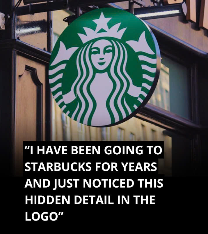
The Starbucks logo is one of the world’s most recognizable emblems, greeting millions of coffee enthusiasts every day. But did you know that this iconic logo contains a subtle secret that most people overlook? At first glance, the Siren’s face appears perfectly symmetrical, but a closer inspection reveals a hidden detail. Let’s explore the story behind this fascinating feature and why it makes the Starbucks logo so unique.

The Evolution of the Starbucks Logo
Since Starbucks was founded in 1971, the logo has undergone several changes. The original design featured a brown, double-tailed mermaid known as the Siren, inspired by nautical themes and Herman Melville’s novel Moby-Dick. This early version of the logo was meant to evoke a sense of mystery and adventure, representing the allure of the sea and the enchantment of coffee.
In 1987, the logo transitioned to its now-familiar green color, symbolizing growth and freshness. As Starbucks continued to expand, the logo underwent further updates, becoming more refined in 1992 when the company went public. However, the most significant redesign came in 2011 when the words “Starbucks Coffee” were removed, making the Siren’s face the sole focus. This bold move allowed the logo to represent not only coffee but the brand’s broader offerings as it diversified into new markets.
The Symbolism of the Siren
The Siren in the Starbucks logo is more than just a pretty face; she represents the seductive appeal of coffee itself. Just as mythological Sirens lured sailors, the Siren symbolizes the irresistible pull of Starbucks’ coffee. As Starbucks sought to expand beyond coffee, the Siren had to evolve as well. The brand needed a logo that could symbolize not just its coffee roots but a wider range of products and services, including teas, snacks, and even alcoholic beverages.
The Intentional Imperfection
When the global branding agency Lippincott set out to redesign the Starbucks logo in 2011, their goal was to create a Siren that exuded confidence, allure, and approachability. Initially, they designed a perfectly symmetrical version of the Siren’s face, but something didn’t feel right. According to creative director Connie Birdsall, “She was uncannily beautiful, a bit creepy, to be honest.” The flawless symmetry made the Siren seem artificial and distant, which conflicted with the brand’s approachable image.
To address this issue, the design team decided to introduce a slight imperfection. Birdsall noted that this small flaw was crucial in making the logo successful. “The imperfection was important to making her really successful as a mark,” she explained. By adding asymmetry, they made the Siren more relatable and human, creating a warmer and more inviting logo.
The Hidden Asymmetry
If you take a closer look at the Siren’s face, you’ll notice that it’s not perfectly symmetrical. Specifically, the right side of her face is slightly different—it has more shading, and her nose dips a bit lower on that side. This small detail adds a touch of humanity, making the logo feel less like a flawless mask and more like a welcoming symbol.
As design partner Bogdan Geana noted, “It felt a bit more human and less like a perfectly cut mask” after the asymmetry was added. This small but impactful change transformed the Siren from a cold, idealized figure into a relatable icon for millions of coffee drinkers worldwide.
Why Asymmetry Works
The decision to make the Siren’s face asymmetrical defies the conventional idea that beauty lies in perfect symmetry. The Starbucks team realized that too much perfection could make the Siren seem distant and unapproachable. By adding a slight imperfection, they gave her a friendlier and more inviting quality. This subtle change was essential in helping customers feel a deeper connection with the brand.
The Siren’s Expanded Role
In the 2011 redesign, Starbucks also removed the words “Starbucks Coffee” from the logo. By then, the Siren had become so recognizable that the company no longer needed text to communicate its identity. This allowed Starbucks to expand beyond coffee, offering a broader range of products, from breakfast foods to evening snacks and even wine.
The Subtlety of the Starbucks Logo
The next time you hold a cup of Starbucks coffee, take a moment to study the Siren’s face. Her hidden asymmetry serves as a reminder that imperfection can make things more relatable, human, and approachable. This subtle detail isn’t just a quirky design element—it’s a testament to the power of thoughtful branding.
The hidden asymmetry in the Starbucks logo highlights how small imperfections can make a big impact, turning the Siren from a mere symbol into a more human, approachable figure. This design choice reflects the idea that genuine connections are often found in the flaws that make us more relatable, whether in people or in brands. The Starbucks logo remains a perfect example of how even the smallest details can enhance a brand’s identity, making it feel warm, welcoming, and accessible to customers worldwide.